


Designing for mobile
When we design for web the process of imagining how the design will look to the end user is relatively simple. That is, they will see basically what we are concocting on screen in our chosen design program. However for mobile and app design, the process is more complex. What appears to work on computer screen can vary on an Android, IOS or Windows device.
A great tool is Skala Preview by bjango. A free app to download to a mobile device, it syncs to the app on your Mac or PC and will show a selected psd screen on that device.
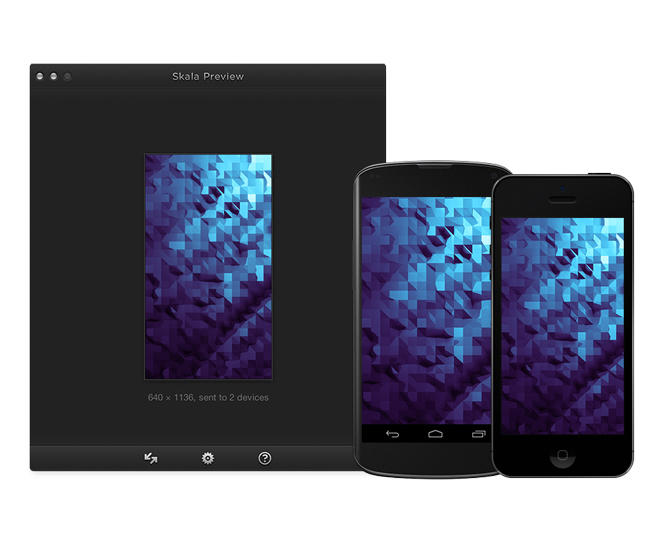
Sizing
What works on a computer screen may not on a small device. I have found that once in a small screen space, a design that appeared to work can look cramped or cumbersome, with buttons and type verging on microscopic or appearing oversized. Yes there are some 'rules' about type sizes and button sizes for tap states but fonts vary and button usability can be impacted by what's happening in the space around it. Consistent review on device though the design process saves much needed time by avoiding big changes later.
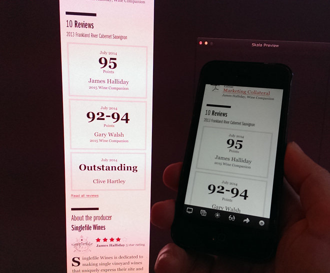
Colour
If you have the commitment and want to drive yourself slightly crazy, use multiple devices to compare your design within. The colour difference will surprise you. For example an iPhone 4 gives almost a subdued rosy tint to colours whilst some androids will pump them up to neon grade. You can't change colours for all devices but if you are noticing strong variation, providing a separate colour palate for iOS and Android to your Developer will help to give some consistency to your much loved design when it goes live.
Another cool feature is the ability to see the screens from the perspective of someone who sees colour differently (this includes people with protanopia, deuteranopia, tritanopia or complete colour blindness). This may factor into your design, particularly as in Australia approximately 1 or 2 in every 20 males deal with some type of colour deficiency (source: betterhealth.vic.gov.au)


