


Goldilocks and the three micro-UX features
Online communication consists of many elements - text, images and colour and proportion all combining to enable communication of your key messages. A recent addition to the gestalt is ‘micro-UX’ or subtle movement and transition effects that support engagement with the website experience.
Micro-UX is a bit of a buzzword/buzz-concept at the moment. Everyone seems to be doing it at some level. But I’d like to question what level of utilisation is appropriate for your website?
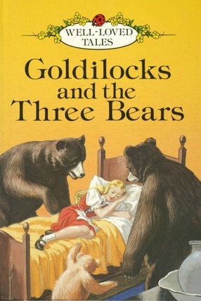
We’re all familiar with the story of Goldilocks and the Three Bears. The house in the forest she stumbled across, the bowls of porridge she tasted (too hot, too cold, just right), the chairs she sat in (too big, too small, just right) and the beds that she decided to try out (too hard, too soft, just right). From this tale has come a more modern theory known as the Goldilocks principle. The Goldilocks principle states that something must fall within certain margins as opposed to reaching extremes in order to be effective (i.e. just right). The principle is applied widely across a number of fields including cognitive science and developmental psychology, astrobiology, economics and in the context I’d like to consider in this blog post, communication.
The Goldilocks principle states that something must fall within certain margins as opposed to reaching extremes in order to be effective
If you take ten minutes to look at this showcase of micro-UX patterns you might have an experience similar to one that I had. At first you’ll probably think ‘oh wow, cool!’, ‘I want to do that on my site’ but as you continue to browse the whole thing becomes a little bit overwhelming. Elements fading in and out, bits of text wobbling to get your attention, the term 'smoke and mirrors' comes to mind.
In fact, I was discussing implementation of micro-ux features recently with a client and likened the experience of micro-UX overuse to that of walking down a street full of buskers all vying for my attention when all I wanted to do was experience the walk down the street itself. The effects, when over used become tedious, distracting and tend to lose their impact the more time you spend on the site. There needs to be a balance between flair and delivering the user the information that they came to your site for.
So what is ‘just right’ for your site? Well that depends on the style of the site, your value proposition and how you use micro-UX. In the context of the showcase site listed above, they probably got their micro-UX just right. But if we lifted all of those effects across to my clients site the experience would be less than ideal. ‘Just right’ depends on your website goals, conversion requirements, site speed considerations and any number of other factors that you may need to consider as part of your website visual and functional identity. It all comes down to context and balancing the ‘wow’ factor against what you originally wanted the website for.
Get it right and watch conversion rise, get it wrong and you may negatively impact your overarching goals.
Dont be suprised if you get your micro-UX just right and wake up in a bed surrounded by a group of anthropomorphic bears.


