

Information Is Beautiful
The amazing website www.informationisbeautiful.net was brought to my attention by Econsultancy this week and it is an absolute visual delight.
Its creator, David McCandless, an independent data journalist and information designer has made it his mission to distil the world’s data, information and knowledge into beautiful, interesting and above all, useful visualisations, infographics and diagrams.
One must remember that communicating data in its raw form can be hugely challenging with the results often not worth the effort. Graphs and charts often come across as boring and hard to read, with their intended insight often lost along the way.
McCandless and his team's works are mesmerising, humorous and incredibly insightful. With each one leaving you educated, humoured and aesthetically pleasured.
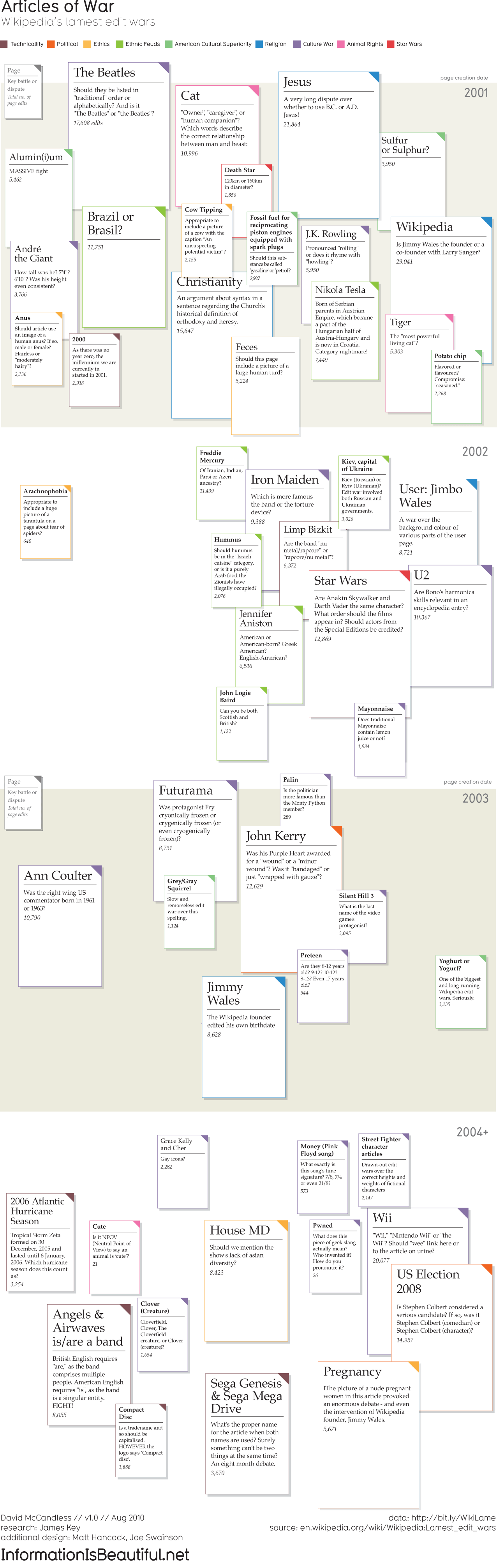
Wikipedia’s Lamest Edit Wars
This had my in stitches. Just read the Anus argument.
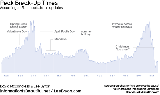
Peak Break-Up Times According to Facebook
Note the peak in pre-party season break-ups on both sides of the hemisphere.
Timeline of Global Scare Stories
I must have missed the killer wasps memo.
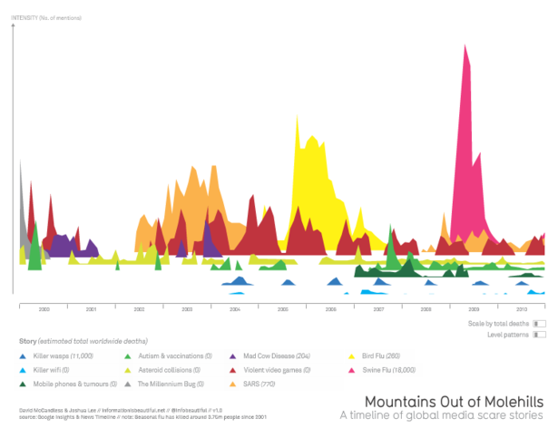
Click for interactive timeline.
The Truth About Twitter
The majority of tweets are just inane pointless babble. Who’d a #thunk?
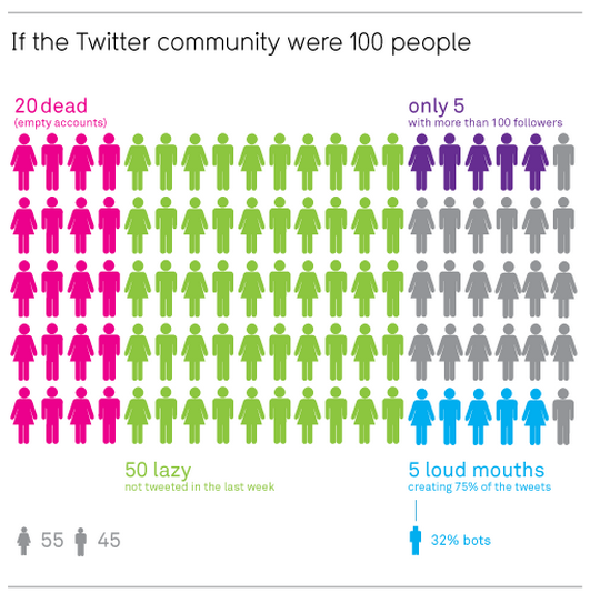
Click for full infographic.
World's Biggest Data Breaches
Selected losses greater than 30,000 records
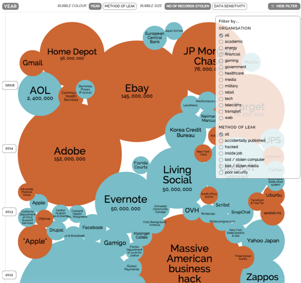
Click for interactive visualisation.
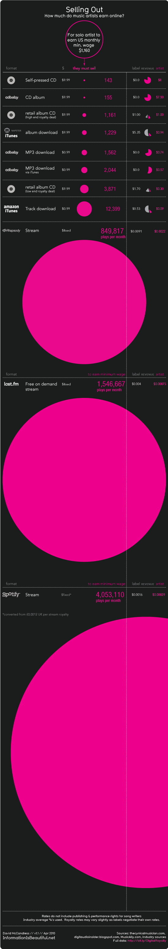
How Much Do Music Artists Earn Online
New laws have been passed in the UK which include huge measures to combat online music.
Much was stated about how this would protect the revenue and livelihoods of musicians and artists, but how much money do they really get paid in this new digital marketplace?