


Mobile first?

Designing for mobile versus desktop
Which should you tackle first: the design for large desktop screens, or the one for mobile devices?
Starting with smaller screens forces you to create a lean, focused design. All the necessary content is built into the mobile version from the outset.
Starting with mobile doesn’t mean you’ll scale back your desktop site. Instead, that you can make “progressive enhancements” to supplement the large-screen experience.
This type of site development goes hand-in-hand with responsive design too.
The 7 key principles of mobile web design:
1. Design for mobile based on most popular and/or important content
What are the majority of visitors looking for on your site? That’s the content you should put front and center in your design. It must be easy to find or use, or your site visitors will move on to someone else.
2. Everything should be available…
Even if not everything is visible. In other words, make sure mobile users have access to the majority of your site’s content. It’s frustrating to look for needed information that’s simply not available on the mobile optimized site.
On the other hand, just because the content is there doesn’t mean it has to be linked to via the main navigation bar.
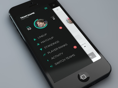
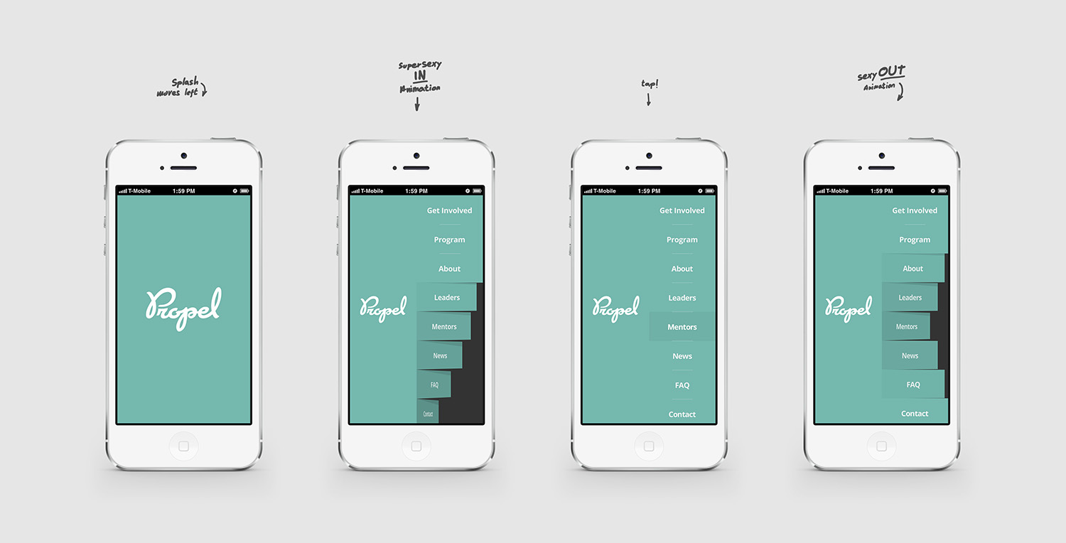
3. Limit navigation options
As noted above, you need to be choosy about the information that you put front and center.
Too many menu layers, too many clicks, too many choices, you have to simplify if you want your site to be mobile friendly.
David Moth of Econsultancy recommends no more than three layers of menus and a max of five or six menu items.
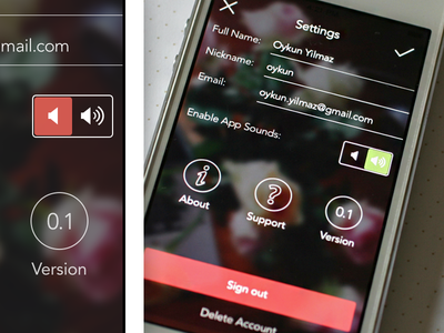
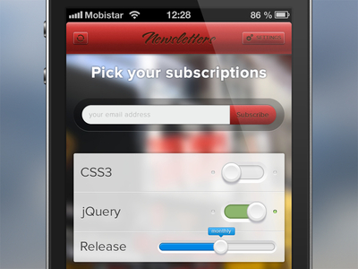
4. Buttons matter
Thumbs aren’t the most accurate pointing device; putting buttons too close together will only lead to frustration.
Who wants to keep hitting “reload” when the button you’re trying to click is “submit”? avoid tiny fonts and minuscule buttons.
Instead, use elements that are sized for easy clicking.

5. Watch your media
While the aesthetic design of your website is extremely important, media elements can cause mobile browsers to trip up.
Keep an eye out for overly large image files, bloated fonts that load too many unecessary characters, and videos in formats — like Flash — that won’t play on certain mobile operating systems.
6. Pop-ups are problematic
If you’re throwing too many pop-up surveys or sign-up boxes at your mobile visitors, they’re going to get annoyed. It’s frustrating to get rid of pop-ups on a small screen.
Unless it’s absolutely necessary, avoid them.
7. Don’t require too much text
Forms are a pain to fill out when you’re typing with your thumbs. Keep the text input needed to a minimum. No essays, please!


