


These tablet experiences suck
I love my tablet. Until I was given one a couple of years ago, I never thought I'd like tablets as much as I do now. But that's not to say there aren't a few things that annoy me - and it's not the fault of the device. Fair warning, if you're not interested in a self-indulgent venting of certain tablet design 'faux pas' then move on. Otherwise, let me enlighten you as to why it's time to put an end to these all-too-familiar scenarios. Because it's 2016 and we should have moved on from these silly issues already. (So why haven't we?)
<rant>
Insist on proper device recognition
When I'm surfing on my tablet, I am using a device with a screen resolution more in-line with a desktop or laptop. Thus, it's pretty frustrating when somebody has been too lazy to implement proper device recognition on their shitty old adaptive site. This is very important, especially if you haven't yet taken your website to a responsive level (and I admit there are a few scenarios, and a few clients I know of, that have justified arguments to maintain adaptive sites over going responsive).
I feel this is often overlooked. Since my device goes to the trouble of telling the web server what type of device it actually is (via the user-agent string), it would be nice if the web developer had actually gone to the effort of ensuring I am served the most appropriate site.
All too often, despite the user-agent informing the server that I am browsing on a tablet, I'm still served up a stripped-back site designed only with a mobile phone in mind.
Why do people seem to think, because a tablet is a mobile device, therefore it should be shown the mobile site? We all know that a mobile adaptive site is often restricted to a paltry 320px wide, or 640px for retina. I therefore end up with a skinny mobile site, along with all the hidden menus, hamburger icons, reduced content (etc.) that goes with it. There are several content heavy sites that I use on a regular basis (news and photography sites are littered with examples) and the very first thing I have to do when the page loads is - annoyingly - spoof the user agent and request the desktop version of the site. And though you might do this once, you'd think perhaps it retained this position unless reverted? No, there's never a cookie or anything that stores your preference. So you are forced to change to the desktop site. Every. Single. Time. Uagh.
There are ways to identify devices properly. If you feel the need to keep your site adaptive over responsive (even though Google will hate you for it) then at least invest in something like a device recognition solution, like 51 Degrees. Yes, it's expensive to maintain a license, but what's the point in your user having a tablet if it keeps loading the mobile site by default? You're turning people off using your site the moment they land.
At the very least, don't forget to show a link to 'request desktop site' somewhere on the menu/footer (so long as you haven't got one of those new progressive load type websites...). Though Chrome now has an option in the browser menu to request desktop site, not all browsers are made equal. Most browsers don't make this task very easy.
Get your break points right
Your portrait-designed site looks great, in portrait mode. However, did you know that not everybody surfs the net in portrait orientation? My personal prefer is to hold my tablet landscape, though I know that our designers generally prefer a longer view (portrait) so they can see more of the page. I asked around the office to see if there were any reliable statistics that showed if there was a marked trend either one way or the other, and was told that it's generally considered a pretty even split. There's no right or wrong way to do it, the way you decide to surf is a very personal preference - up to the individual.
I wonder if its often got something to do with the fact that iPads have a physical button located at the bottom of the device, which in portrait view is much more conveniently located for the opposable thumb(s). When held landscape, this button would be either on the left or right side, and not as conveniently located. Whereas, Android users - aka Google, Sony or Samsung tablets - have software buttons that will move to the bottom of the screen no matter the orientation. Perhaps I'm wrong, but it's just a thought. Another idea I have is that people are used to reading books, and as the pages within books are generally portrait orientation, this follows through on surfing habits.
Regardless as to why a person chooses to hold a device portrait or landscape, as web designers, we need to ensure that a website looks great in both situations. You need good breakpoints. Now, if you don't have specific tablet breakpoints, then you could default your responsive site to follow the typical - and generally accepted - mobile/desktop split. I.e. when viewed on a tablet device in portrait, it shows the mobile responsive version, yet when rotated landscape, it switches to the desktop breakpoint, which would much more appropriately fill the entire screen. Now of course, that's just a rule of thumb, so whether you can do this (and whether it will look any good!) will depend on your design. But what I do not want to see, is your mobile responsive site showing on my tablet's landscape view. Mobile sites, whether built fluidly and stretched to the extreme of a tablet's display, and everything WAY to large... or fixed width and stranded between two slabs of plain colour (or even worse, horrible background pattern) is just as bad.
Start optimising for tablet
Carrying on from the above theme, mobile apps are notorious for this, as often companies will commission a mobile app, but the designers and developers create it only with a phone-sized screen in mind, and not consider that tablet users will also be downloading the same app via Google Play or Apple's AppStore.
Untappd - you're a classic example... you look great on a mobile phone, but why am I seeing the same thing stretched to buggery on my tablet? This would not take much effort to fix. When I've got the screen real estate, I expect it to be used appropriately, not wasted. And especially not ugly.
Designers and developers need to remember that tablet users expect both websites and apps to take advantage of the larger screen size. Much of the time we feel cheated or ripped off, that no thought has gone into the tablet experience. Especially for mobile apps, remember there is a difference between 'compatible' and 'optimised'. An interesting read on the subject is available over at CIO. And the issue is far from resolved, with plenty of other blogs recently lamenting the general lack of tablet optimised apps out there. At least at Wiliam, we can ensure users have a good tablet website experience!
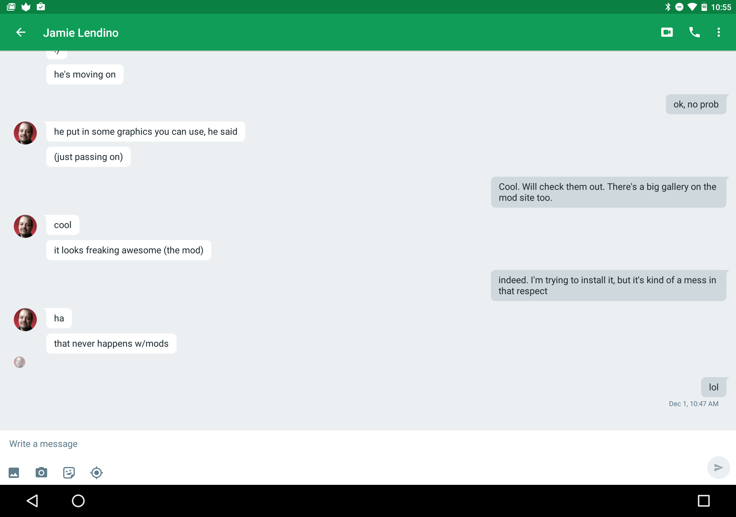
I borrowed this image from ExtremeTech, it shows how even Google's own apps are incredibly poorly optimized for tablets. This chat window is a perfect example of somebody who wasn't thinking beyond the phone when they designed/developed this.
Stop trying to send me to your mobile app!
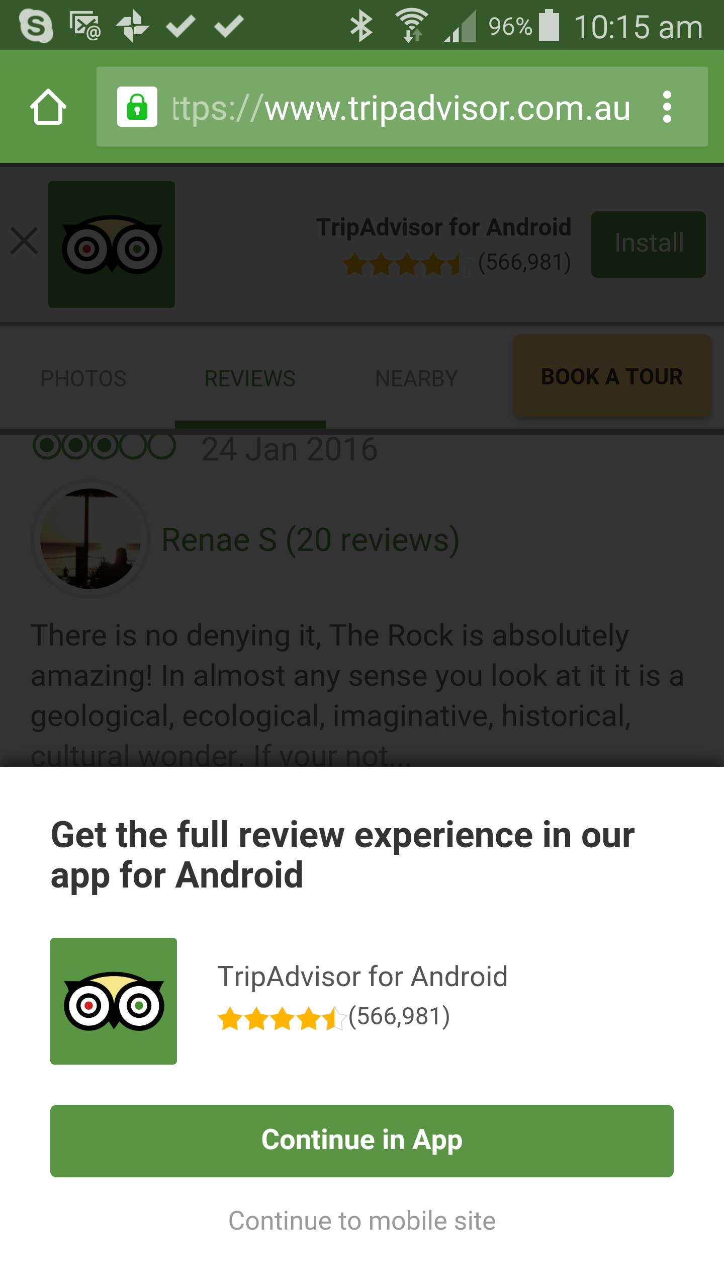
Trip Advisor, I'm looking at you... as a classic example of a practise that is consistently, persistently fair-dinkum bloody annoying. Trying to use the Trip Advisor website on a mobile phone is a nightmarish experience. At every turn, TripAdvisor is in your face, blocking content and trying to push you down the route of installing and opening its app for the 'full experience'.
We've talked about this before. Rob wrote an article about it a couple of years back, and it was as true then, as it's true today. Just because you have a mobile 'app' doesn't mean I want to use it. In fact, have you considered that I may deliberately want to avoid your app, because like many ill-considered apps, it's either not optimised for tablet, or it's a poorly designed afterthought to your responsive website which is in fact a much better, useful experience. So when you pop up reminders, messages, and overlays consistently trying to drive me into your app... I hate you. So much that I actually stop using your site on my mobile device, preferring to wait until I get home to use a laptop instead. Or I just look for information elsewhere online.
</rant>


