


The New Hoyts Mobile Site
Last November I wrote about everything wrong with the Hoyts mobile site, and now a month and a half later I’ve noticed they’ve brought out a new one!
I’d like to think that they read my blog and took what I said on board, in fact I am going to think that. That’s why.
I couldn’t resist reviewing their updated site as I found many issues with the old one.
So has it improved? Let’s see…
New Header
First of all I can say that the header has improved. They’ve reduced the options and made it much simpler by making the two main items ‘Featured’ and ‘Movie Times’.
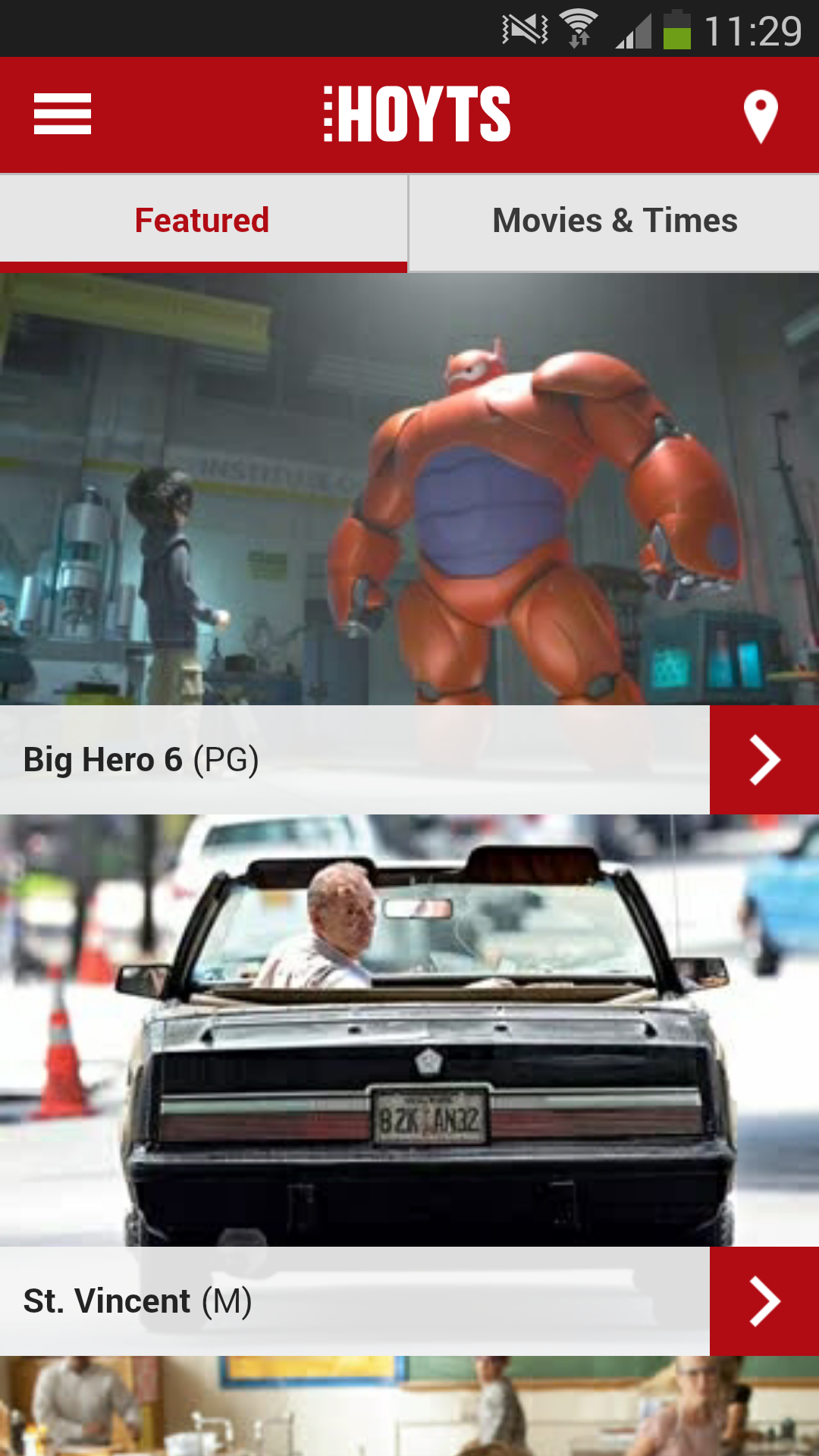
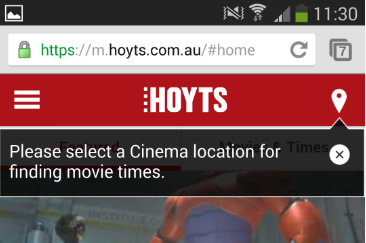
There is also the option to set your Location with the pin in the top right. Don’t know that the pin symbol means Location? An unobtrusive tool tip will remind you that it’s helpful to set your Location first.
Movie Times
By clicking on this it takes you to a full list of movies (a reduced list if you already have your Cinema Locations selected). A massive improvement on this page because they actually let you view your movie times while within the list.
OH EM GEE!!!
Now you no longer have to scroll up to the top of the page and back down to find your movie.
HOYTS NOW ACTUALLY LETS YOU BROWSE MOVIES!!!
There’s even a sticky menu which shows your current selected date and left/right arrows to help you easily browse other dates.
I’ll try to contain my excitement and hey no sarcasm this time!
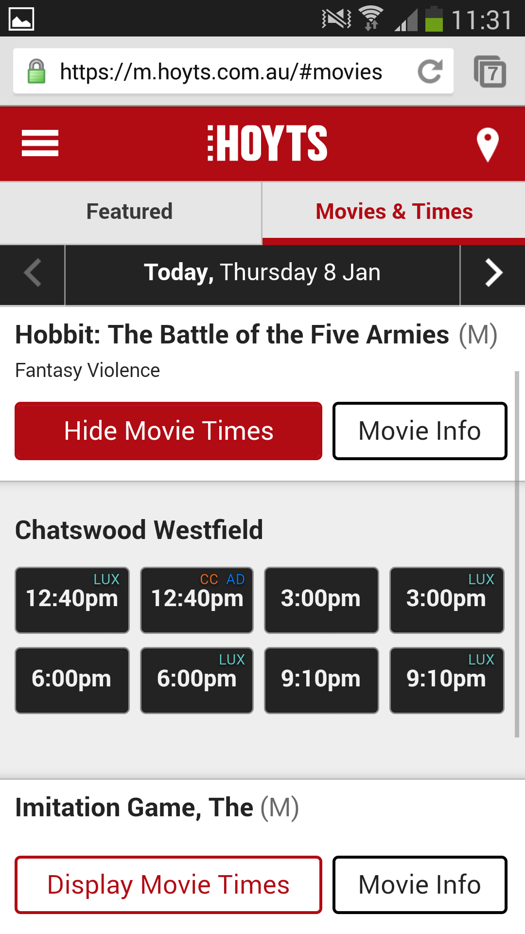
You can either click on ‘Show Movie Times’ for a quick view of sessions or you can click on ‘Movie Info’ to get the movie description, details and trailer. The times are below this as well so no more going back and forth to find all the information that you need. Heck it even has a Display Times button at the top which scrolls you to the bottom just in case you didn’t know the times were repeated down the page again as well.

Locations
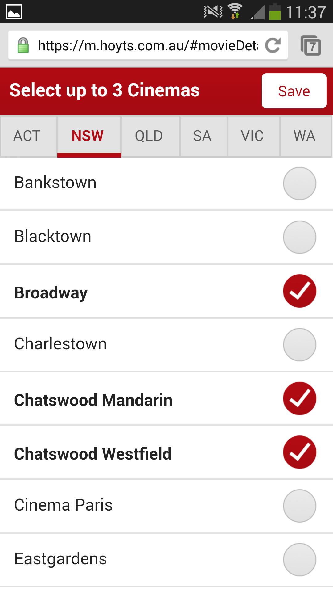
This is my favourite improvement of the site.
They have gotten rid of the map.
WE HAVE TABS.
I REPEAT WE HAVE TABS .
I guess it’s a shame I can’t now compare Cinemas in Perth and Sydney…. Oh wait I never wanted to do that.
It neatly lists the State tabs and the corresponding Cinemas below in alphabetical order allowing you to choose a max of 3.
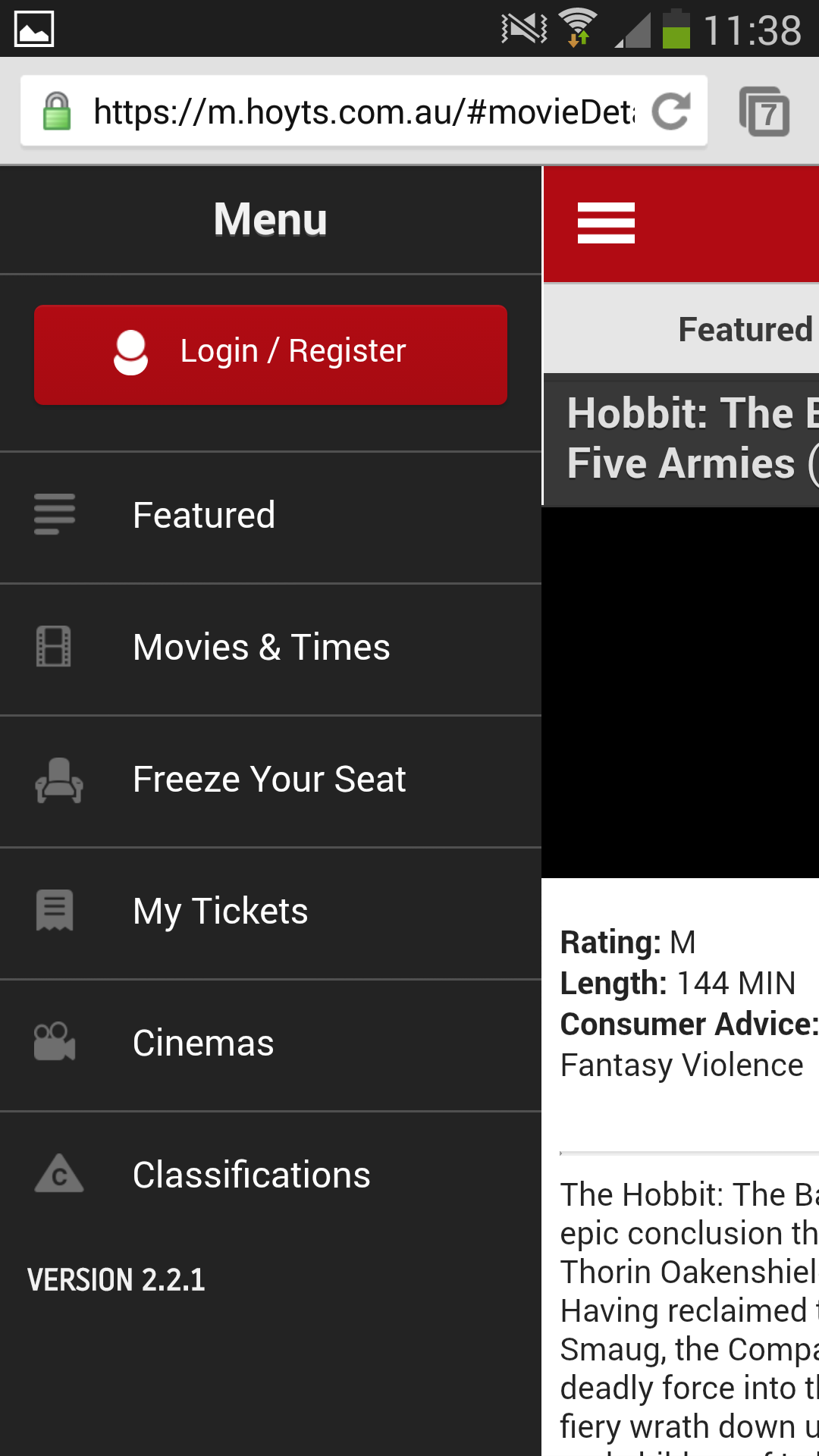
Menu
The menu is brief and repeats the key pages that are on the site with the inclusion of a Login/Register button.
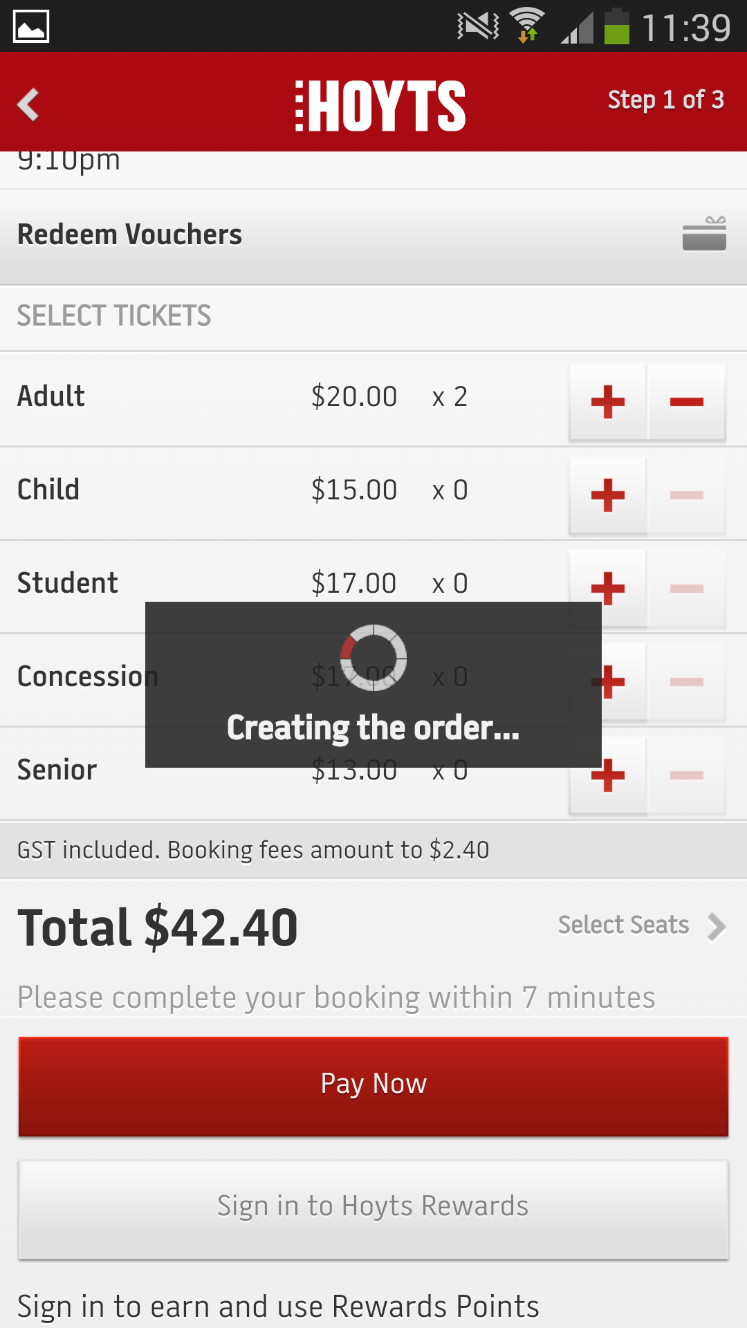
Purchase Process
This is neatly laid out, even with breadcrumbs to let me know I am on 1 of 3 steps.
The ‘Select Seats’ link is a little small but it is near the Pay Now button so users should be able to see it.
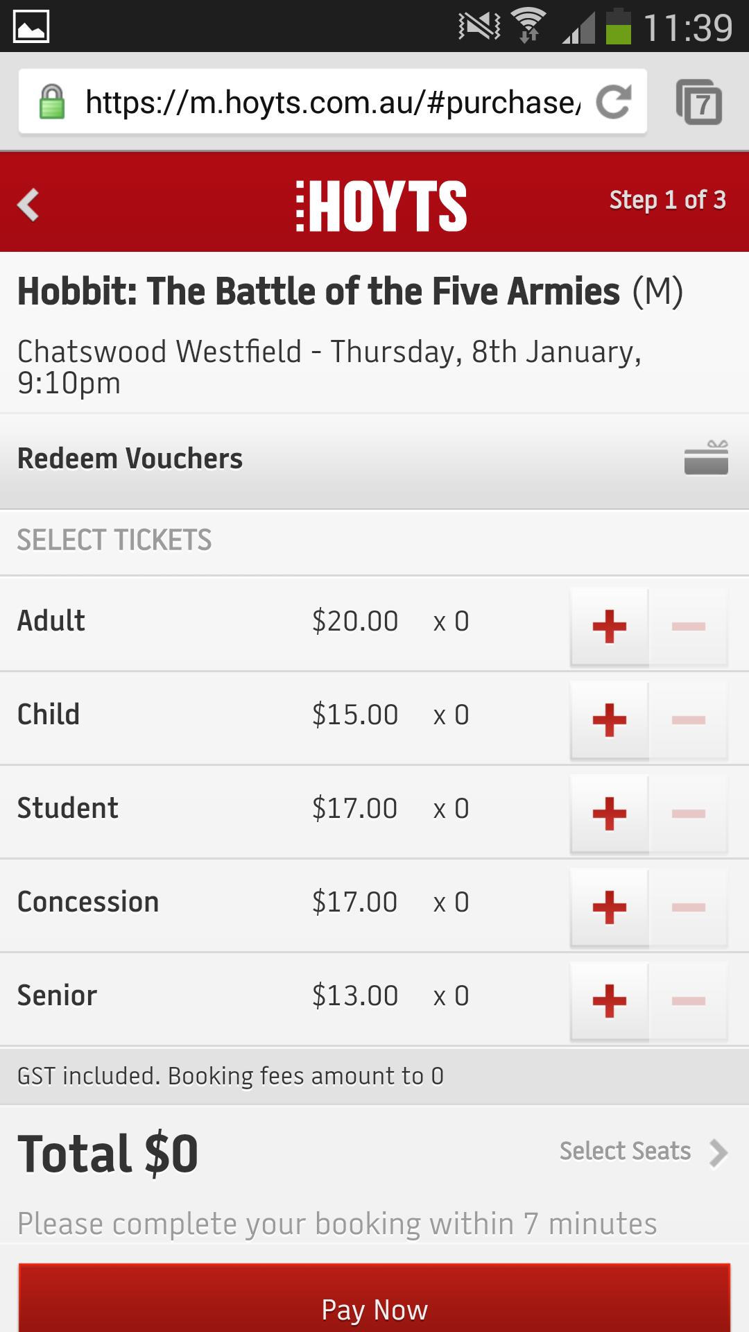
Loading icons let me know something is happening.
Overall Conclusion
I was actually looking forward to writing another rant but I have to say this is a massive improvement to their existing website.
I can’t even fault this, it’s a seamless experience and easy to browse movies and times if you’re not sure what you want to see or when you want to go.
No more downloading.


